MoDuLe 1 eXaM pRaCtiCe..x
Text 1 – Film Poster...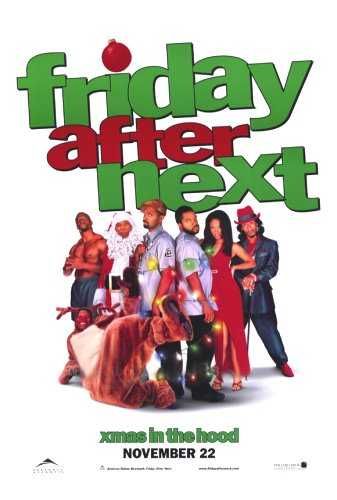
- The title of the film is ‘Friday After Next’ – the title graphics have been written in a simple but bold lower case font which, are slanted and take up half of the film poster; this bold fashion illuminates the title of the film and makes the genre of the film clear: ‘comedy’. This is because the lower case lettering helps to suggest the light hearted and comical tone of the film. Also, the ‘I’ in the Friday has been dotted with a Christmas tree decoration – suggesting the film may be set in this festive season.
- The key image on the poster is a photograph of the main characters in the film. They have been chosen in order to show their importance in regard to the film. We can also see Christmas lights and two of the characters are dressed in Santa Claus and Rudolph outfits; highlighting the Christmas theme of the film. The image used is a long shot and is placed in the centre of the poster – enabling us to view the characters clothing and posture; this helps the audience to be able to gain an insight to the roles and functions of the characters.
- The film appears to be based around Christmas. It seems to be portrayed as a comedy film due to the nature of the written graphics and the images on the poster. For example, the style of lettering and the colours used depict a bright and light-hearted tone. The images used are humorous and display this sense of comedy.
- The protagonist of the film is famous rapper ‘Ice Cube’. Although, the poster does not feature the names of any of the stars, there is evidently an image of him on the poster which may be a successful technique in promoting the film as fans of this artist may be one of the potential audiences.
- The most important colours on the poster are green and red. These colours have been specifically chosen in order to promote the Christmas theme of this film as these are the colours that we would most usually associate with Christmas. Also, these colours are bright and bold, suggesting a bright feel about the film - this makes us recognise the fact that this film is of a comedy genre.
- The catch line is ‘xmas in the hood’. This is placed at the bottom of the poster and is written in the same bold font and in lower case lettering. Also, this phrase is written colloquially – it portrays humour and seems comical. Also, this catch line may have been used to attract the films’ target audience. This is an American film distributed by New Line Cinema. As it would have been released in the
- The poster has been made attractive to the target audience by the use of characters chosen and displayed on the poster, this is because the target audience would recognise much of the cast and may thus want to watch the film. Also, the catch line would be key in appealing to the target audience as they may feel as if they can relate to it and may find this appealing.
- The credit block doesn’t reveal much information apart from the distributors of the film.
- I feel that the USP of this film is that it is directed at a more niche audience although it has been produce by a major and mainstream distributor. Also, it is a film based around Christmas which may do it many favours, especially since it was due to release just before the Christmas period of time – November 22nd. This may encourage many to view it as it appears to have a festive feel about it.
 Text 2 – Magazine Front Cover...
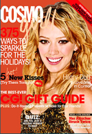
- The title of the magazine is ‘Cosmo Girl’. This title associates its name with its target audience in a sense as it reflects that this magazine is for ‘girls’. Also, the ‘cosmo’ in the title focuses on astrological features which may be published inside this magazine – this could be its USP.
- ‘Cosmo Girl’ is published by ‘Hearst Corp’. This publisher is also responsible for the publication of ‘Cosmopolitan’ magazine which, is considered as the adult version of Cosmo Girl.
- The target audience for this magazine appears to be teenage girls aged between 14 – 18 and predominantly of white ethnicity with middle/working class parents. This can be identified by the appearance of the model on the front cover, as well as the types of articles mentioned and adverts featured. However, as the magazine is broadcasted nationally this magazine may also appeal to others.
- There is one main image over the entire page; this is of ‘Hilary Duff’ whom is a celebrity. This image is a medium close up shot – this emphasises upon the models facial features as well as providing a little bit of her clothing. She appears to be smiling and is wearing fancy clothing – she is depicted as someone the target audience may aspire to be like.
- The features within the magazine are mentioned on the front cover in order to attract the target audience by making them feel obliged to purchase the magazine as they’ll be interested and will want to continue reading the mentioned articles.
- The type faces used are bold and easy to read but still remain to appear girly. The word ‘girl’ in the title seems as if it has been written with lipstick – this enhances a girly effect and makes the magazine appear appealing to its target audience.
- The cover also looks colour co coordinated and bright. The reds, blacks, whites and golds may reflect the Christmas season as this is a Dec/Jan edition. The general layout is similar to that of other magazines of the same kind – publishers know that this will sell.
- The style of the layout looks appealing to the audience as the finish looks fairly expensive – the cover is glossy. The effect conveyed is of a girly and fun nature.
- From the image of Hilary we gather that the magazine intends to represent youthful and independent young women in the making. This is so as there is solely just one image on the cover which is of her and as we can primarily just see her facial features we know she hasn’t been intended to be fetishised therefore she seems to look good – but for herself.
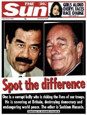
- The masthead is placed at the top of the page – ‘The Sun’. The colours used in the masthead are red and white; this draws attention to it as this differentiates from other newspapers as they most often have their masthead in black and white. Below this is a large image of Saddam Hussain & Chirac – close ups of their faces have been used as they are the focal points of the story. Below this is the headline and sub heading – this appears to be of a comical tone.
- The typefaces and fonts used are bold and simple, this suggests the less sophisticated aspect of this particular paper.
- The photographs on the page take up almost half of the copy. They are in colour and very good quality – this may depict the emphasise on the two men and makes them and the story seem more important. Also, these images appear to have been cropped out of other pictures.
- Apart from this one main story which takes up most of the copy, there is one small brief in the top right hand corner of the copy; next to the masthead. This story appears to be about a celebrity – Cheryl from ‘Girls Aloud’.
- The headline; ‘Spot the Difference’, is written in a much larger size font than the rest of the copy. It is also written in red – this makes it stand out amongst the rest of the writing on the page – highlighting its importance to the copy.
- As the headline is so short, all of the words are key. This particular headline is important as it comes across as very comical and promotes a rather cynical view of a serious topic. This could be a technique to appeal to its audience and others. Therefore, this particular headline would influence the reader to approach this story in a more humorous way.
- There is not any further writing on the copy than the headline and the sub headline – the reader may therefore feel that the copy does not really live up to the expectations produced by the headline. However, this may be a better technique as there is less to read on the copy – just the key information.
- ‘The Sun’ is a tabloid – right wing – red top paper. Therefore, it is renown for sensationalising stories and featuring more gossip and soft news. This is heavily depicted through the presentation of this particular copy as this serious article has been portrayed in a comical tone in order to sensationalise the story to make it appear more interesting and appealing to the reader.
- Rupert Mordoch is the owner of ‘The Sun’. He owns a great fraction of the media, therefore this particular paper helps to promote hegemony as he intends to make the reader feel what he does.
posted by HeavenSent..x @ 6:12 PM
![]()

0 Comments:
Post a Comment
<< Home